Redesigning a high fashion brand.
The Jean Paul Gaultier brand is respected across the fashion world. Cited as being the “bad boy” of haute couture, his designs are innovative, precise, and extravagant. The brand’s current logo doesn’t reflect the current identity of Jean Paul Gaultier, so I decided it was time for a change.

J P G
-
J P G -
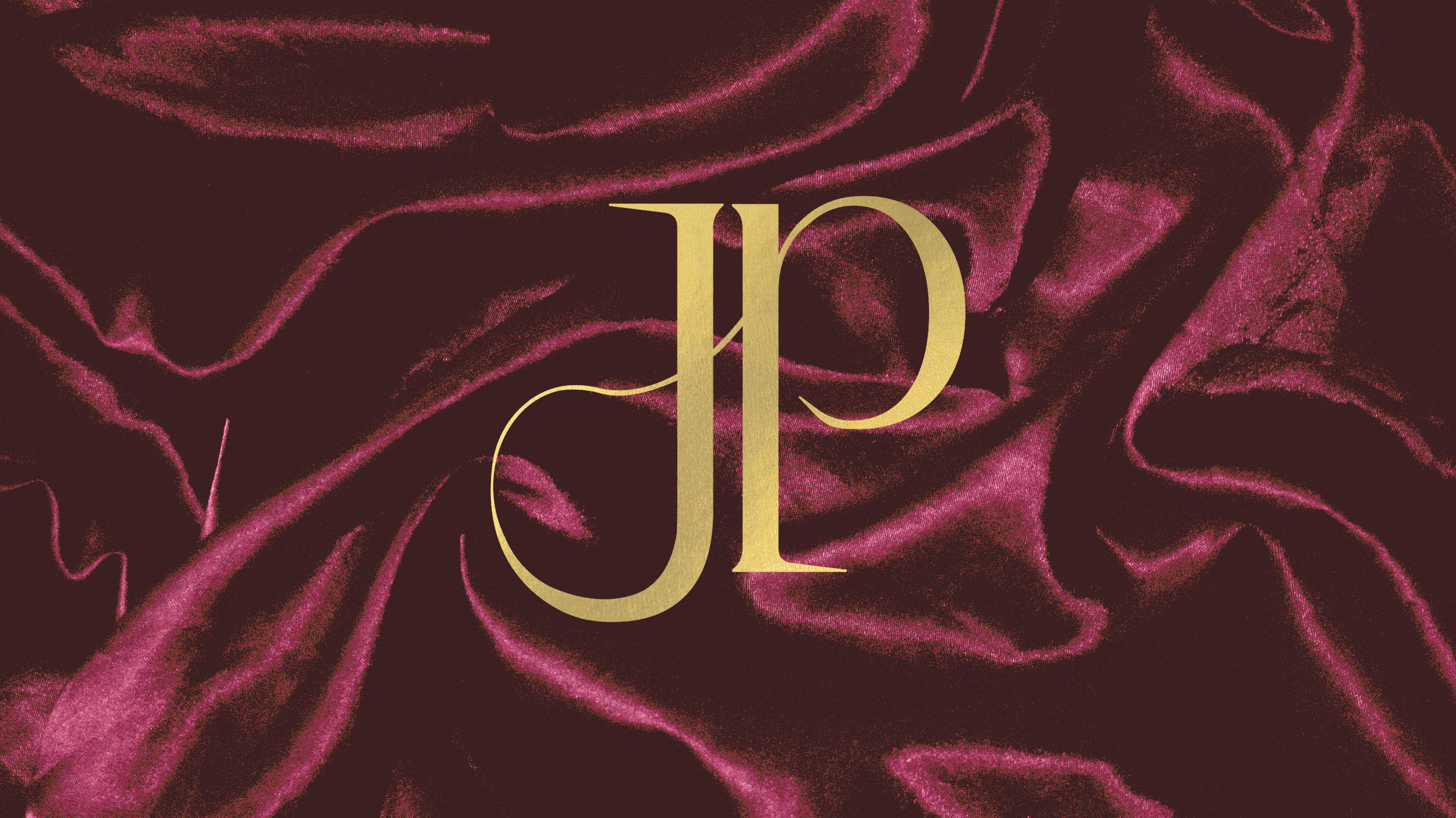
A new era.
Gaultier’s brand is well known for expert corsetry, sweeping romantic gowns, and a generally maximalist approach.
I combined this current identity with my own vision for the brand by exploring more of the dramatic rich themes of his work.

Back to the drawing board.
Preliminary sketches help establish direction and generate ideas. While drawing, I wanted to incorporate the sharp points and organic curves of a needle and thread into the letterforms. I focused on just his initials, “J.P.G.”, instead of the full name.
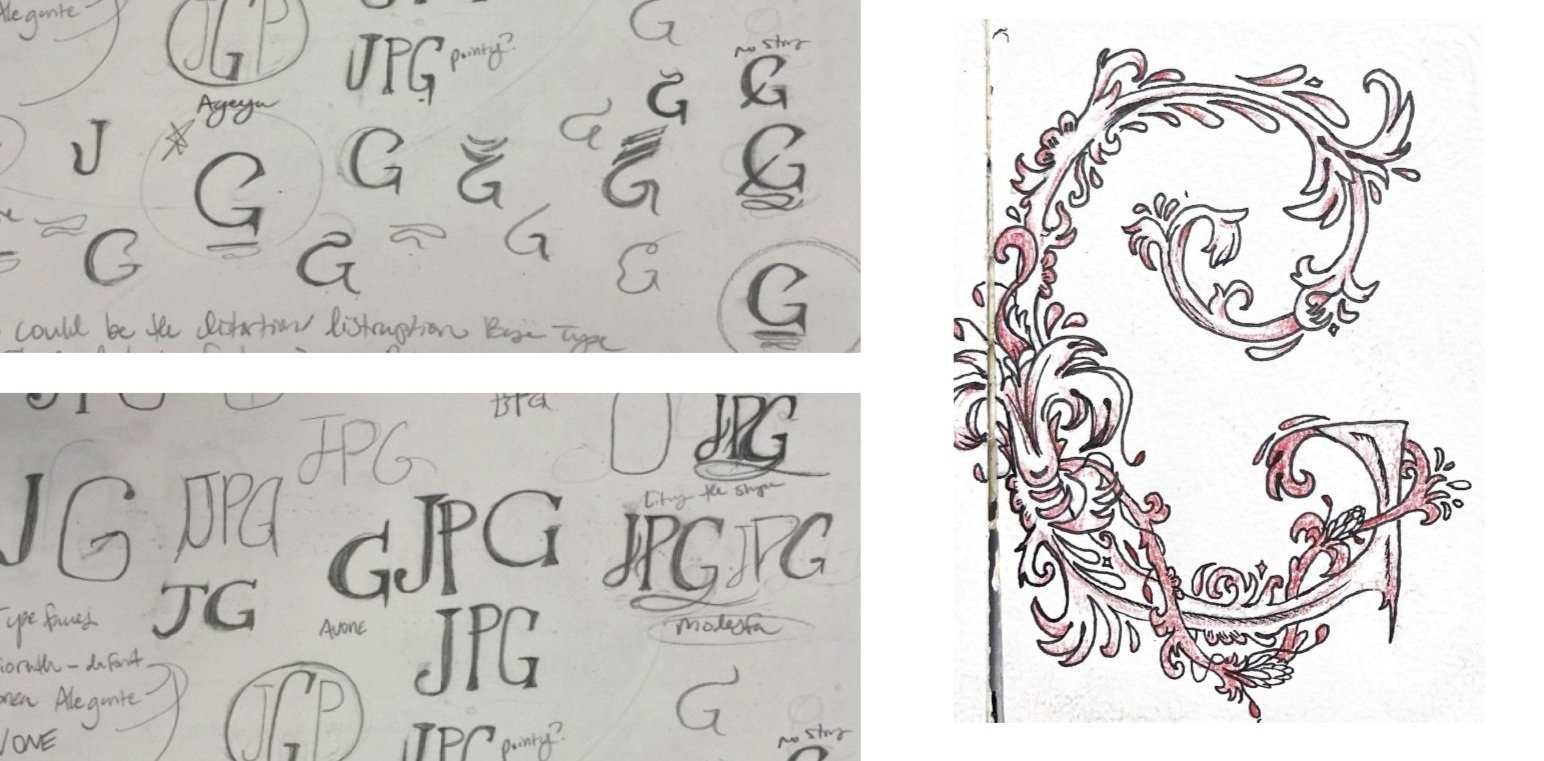
Ideation
Next, the sketches are digitized. While working through new ideas and iterations, I try many different approaches while keeping the same ideas of elegance and precision in mind.

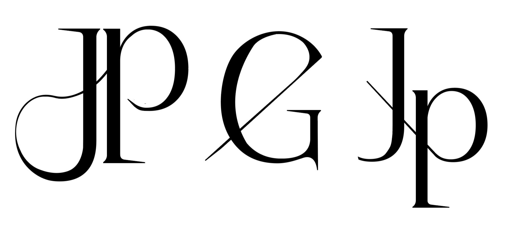
Refining.
The strongest three options are chosen out of all the ideations and small scale changes are made.
Final design.
The sharp serifs and swooping stroke communicates the needle imagery while remaining elegant and refined.

COLLECTION LAUNCH
COLLECTION LAUNCH

After redesigning the logo, work begins on a collection launch to announce the rebranded identity. New touchpoints create this experience include invitations, vip passes, projections, installations, and more.


